Modernizing Medicaid Renewals for the State of Missouri
You can view the project here.
Overview
- Who Social Services, the State of Missouri
- What A self-service portal for Medicaid renewals
- Role Design lead, requirements gathering, functionality workshops, wireframes, mockups, testing, documentation and workflows
Results
Over 20K verified accounts and 2,300 renewals submitted to the online platform since go-live in May 2023.
Challenges
Implementing self-service for citizens
The social services support division for the state of Missouri needed to implement an online self-service portal so their citizens could log in and complete their forms online instead of doing them by mail or in-office. This freed the agents to be able to process these renewals more quickly instead of taking phone calls and appointments.
Tight deadline for phase 1
This project officially kicked off in Feb 2023, with go-live scheduled for May 2023. This included all discovery, design, and implementation phases.
Branding and design challenges
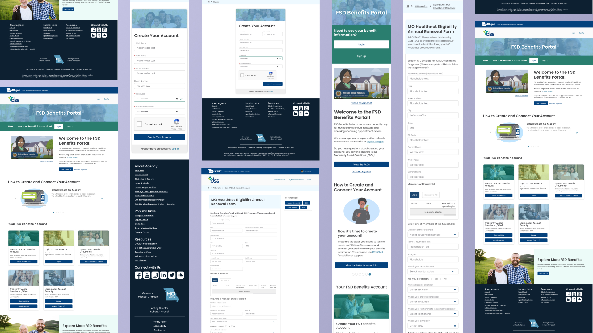
There was some internal miscommunication about the overall branding of the portal, which was a big sticking point for the agency. We agreed to keep the phase 1 design with minimal branding and as close to out-of-box (OOB) as possible to meet their phase 1 deadline. Phase 2 included a design refresh, which went live Oct 30th.
Process
Functional requirements
I worked with our delivery team and developers on listening in to requirement sessions, as well as developing and leading a functionality workshop to ensure we had captured both branding requirements and functional requirements.
Visual research
I also do visual research from the client’s website, to what other ServiceNow partners do, to what other designers outside our industry do. How are they solving problems? Are they laying out things in a unique way? It helps give me ideas for potential layouts.
Sketching & wireframes
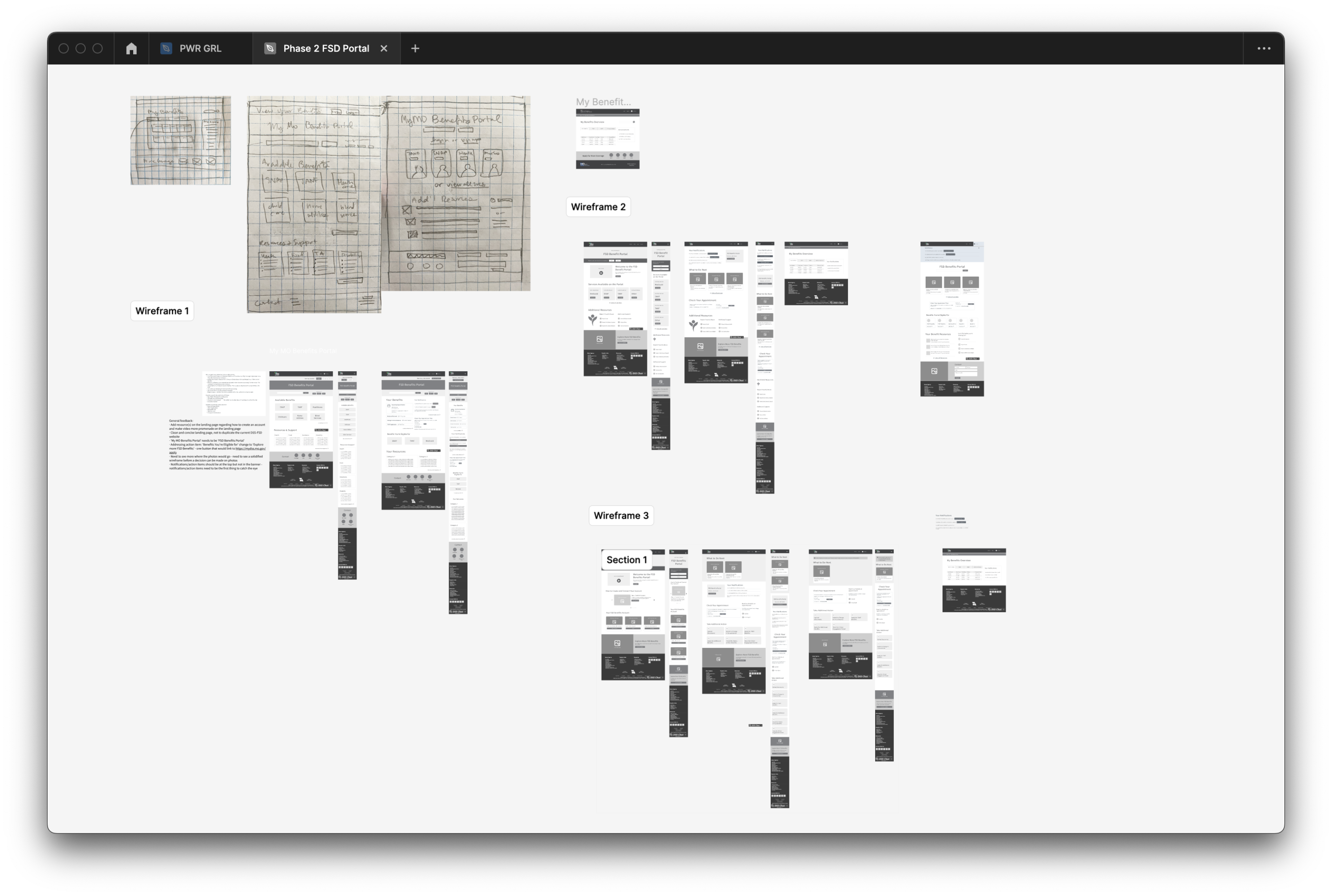
I usually start with pencil to paper and sketch several potential layouts. I take these sketches to some of our developers, and we walk through each potential layout and discuss what is most technically feasible for our allotted development time.
I then turn these into digital wireframes, which are given one additional review by our dev team before undergoing client review.
Mockups & iteration
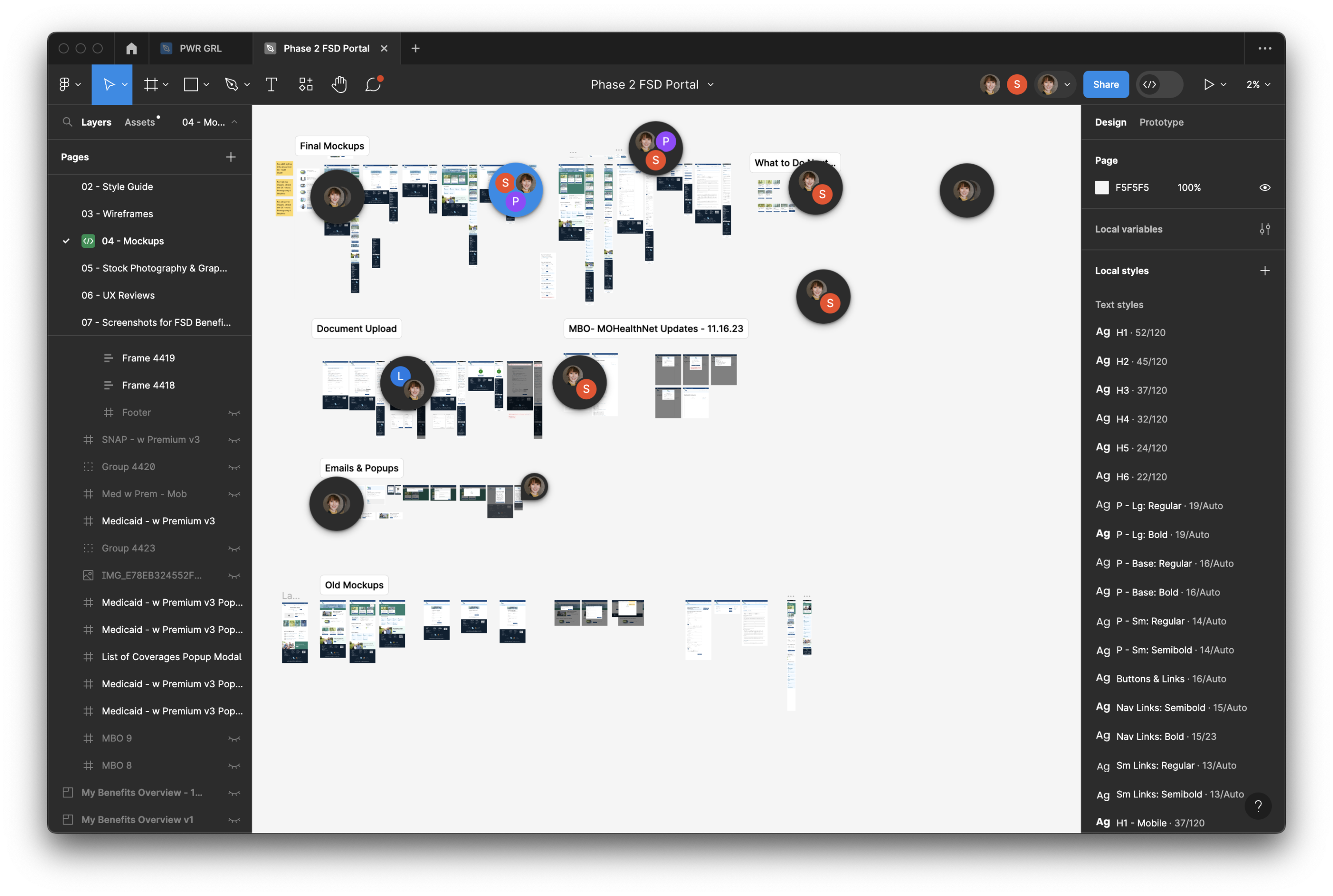
Once we’ve gotten approval on wireframes, we begin developing the style guide (type, colors, icons, buttons/links, etc) and the mockups. These also undergo a final review by our project team before final review by clients. Once final approvals are given, I continue to think about additional views (what does something look like with one, none, or many?) and continue to work with the development team for styling for alerts, popup modals, and other mockups as needed.


