Garlick Sugar E-Commerce Site
A Case Study
Overview
Product
Garlick Sugar is a clothing and accessories brand looking to build a website to boost sales, increase email newsletter subscriptions, and increase their SEO.
Project duration
Jan 2023–Mar 2023
Goal
Design a responsive website that allows them to better control their profit margins and increases subscriptions to their newsletter.
Roles
UX designer designing the website from conception to delivery.
Research
Methods
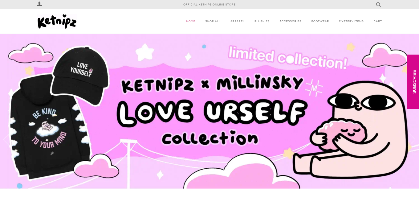
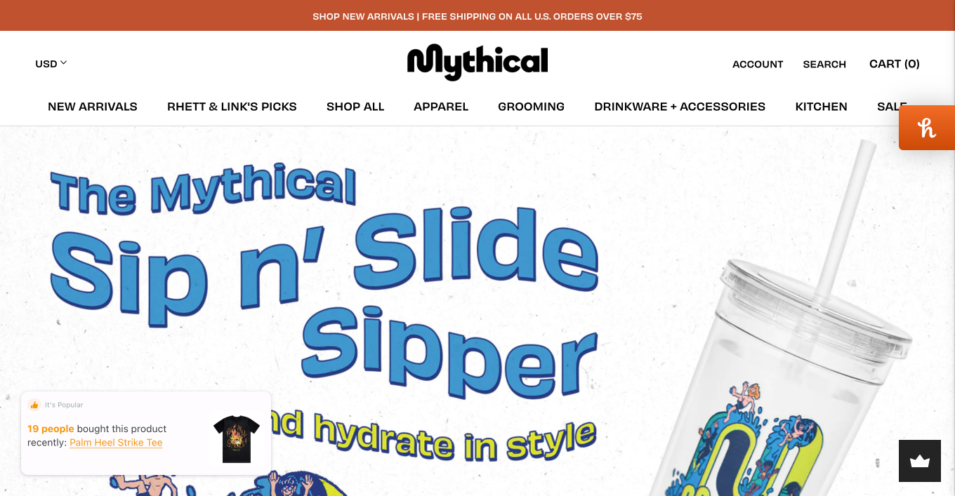
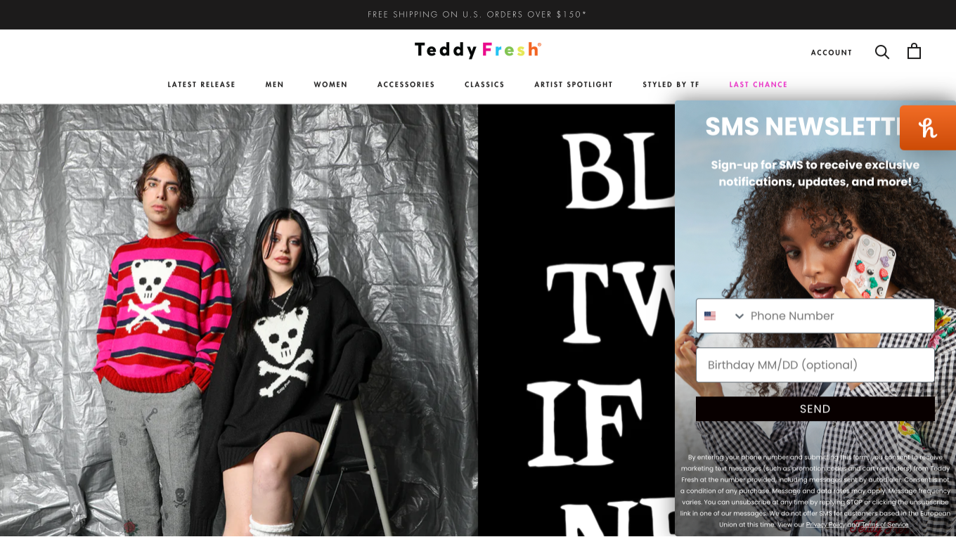
- Competitive Analyses
- Information Architecture
Insights
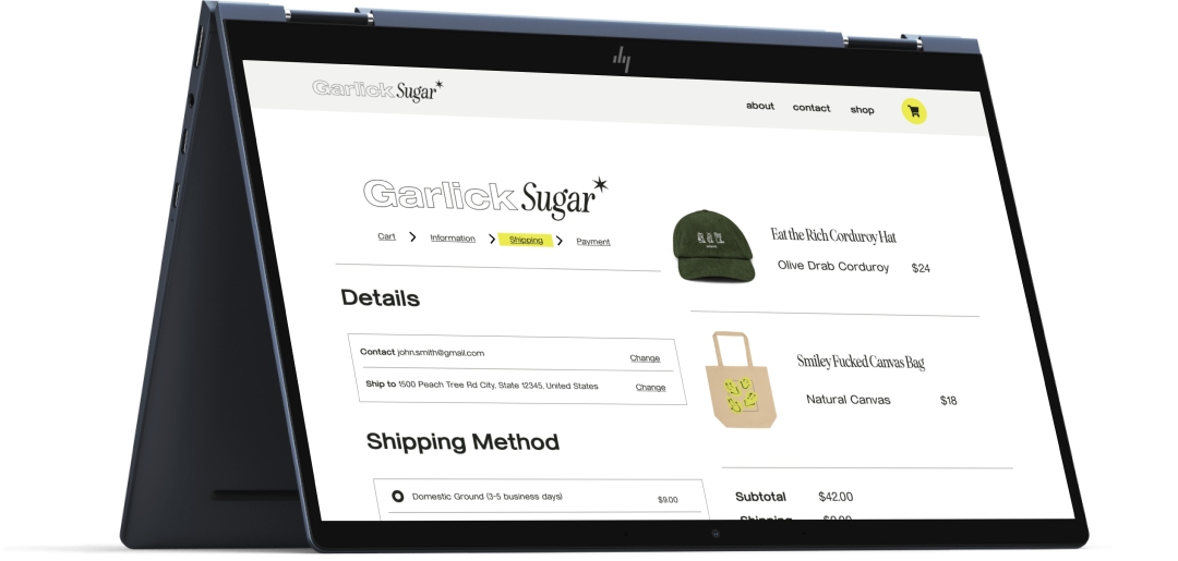
Primary user groups are young adults typically ranging from 18-25. Research indicates that users prioritize an explicit and intuitive experience from cart to final payment.
Pain Points
Is it clear? Is the navigation simple? Are users secure where they are in the process?
Is it intuitive? Does the flow make sense? Can users easily navigate through it without any additional info?
Is it unique? Is the site and the products it offers unique? Is it worth sharing?
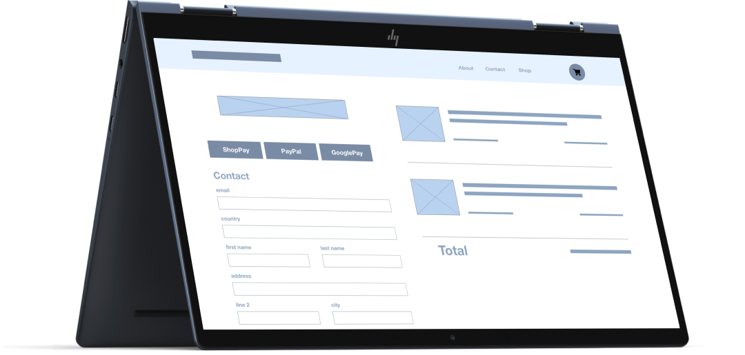
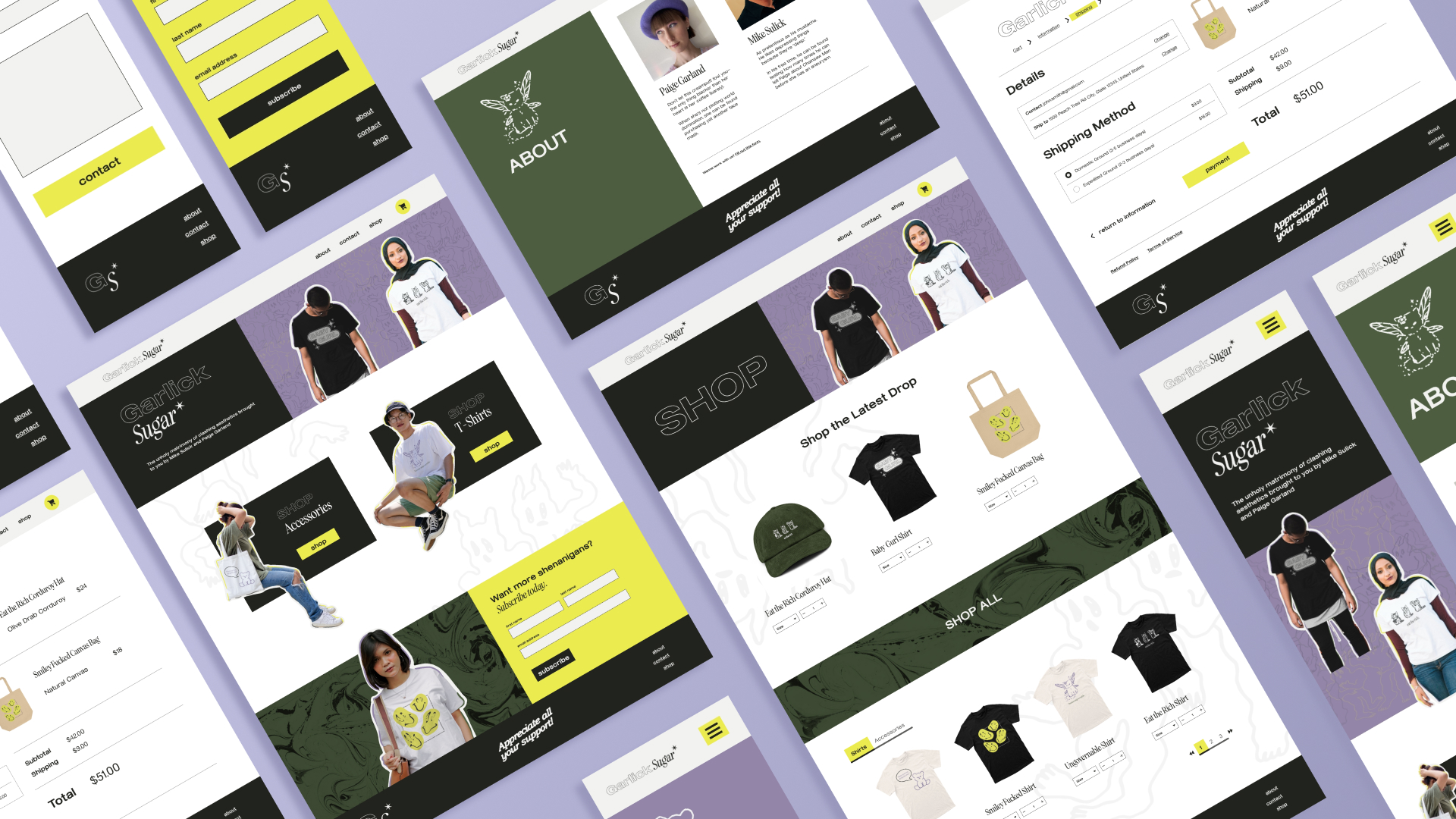
Wireframes & Mockups
Takeaways & Next Steps
Takeaways
- Assuring users in their decisions.
- More intuitive flow = less abandoned carts.
- Iteration is key!
Next Steps
Usability Research Conducting heat map and A/B testing to determine additional areas of improvements.
Quality of Life Adding account settings and implementing additional subnavs in the main menu.