Enhancing City of Reno's 311 Non-Emergency Services
You can view the project here.
Overview
- Who City of Reno, NV, USA
- What A self-service portal non-emergency constituent services; constituents can create, track, and respond to cases
- Role Requirements gathering, functionality workshops, wireframes, mockups, testing
Challenges
Mobile and accessibility-friendly
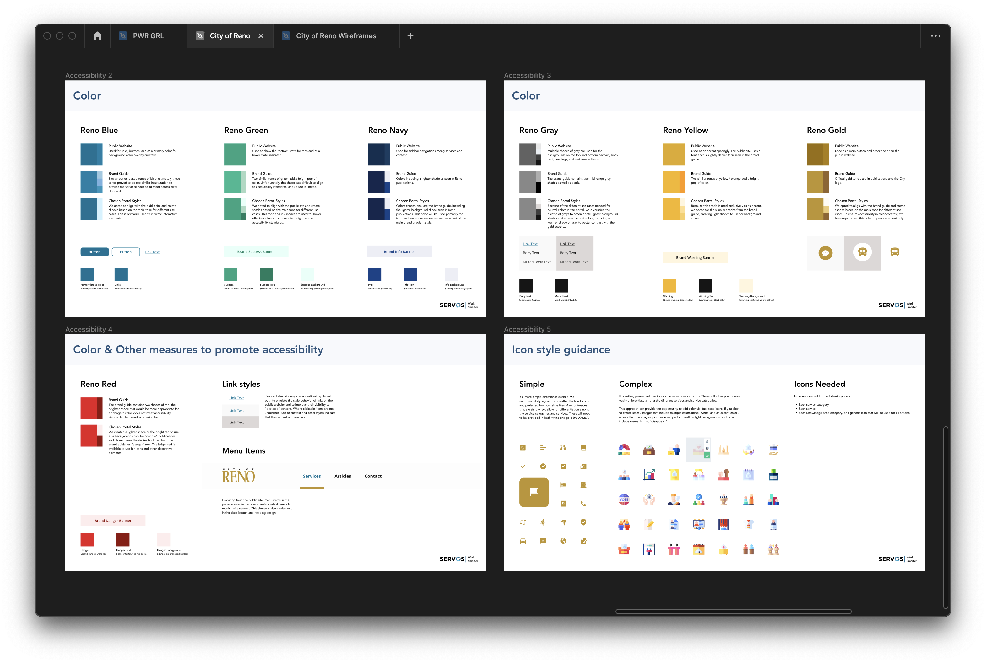
Special care was taken to ensure this portal was mobile-friendly, and the City of Reno was especially particular about the portal meeting accessibility standards…even if their own website didn’t meet said standards. Their particular shades of green and yellow were a challenge to find tints and shades that passed AA accessibility standards.
Challenging the status quo
There was a lot of “that’s the way it’s always been done,” and we had to challenge the Reno team to see our vision for both the portal design and the updated processes that would enable the portal to work at its most transparent and efficient.
Adding a map integration for display open requests
One of the City of Reno’s requests was to display a map displaying open requests by each type of service form. This required additional integrations, and it also required balancing that much information without it being overkill.
Process
Functional requirements
I worked with our delivery team and developers on listening in to requirement sessions, as well as developing and leading a functionality workshop to ensure we had captured both branding requirements and functional requirements.
Visual research
I also do visual research from the client’s website, to what other ServiceNow partners do, to what other designers outside our industry do. How are they solving problems? Are they laying out things in a unique way? It helps give me ideas for potential layouts.
Accessibility
I worked alongside the design manager for this project to test and tweak variations of action colors, buttons, and icons styles to ensure the styles at least met AA accessibility standards.
Sketching & wireframes
I usually start with pencil to paper and sketch several potential layouts. I take these sketches to some of our developers, and we walk through each potential layout and discuss what is most technically feasible for our allotted development time.
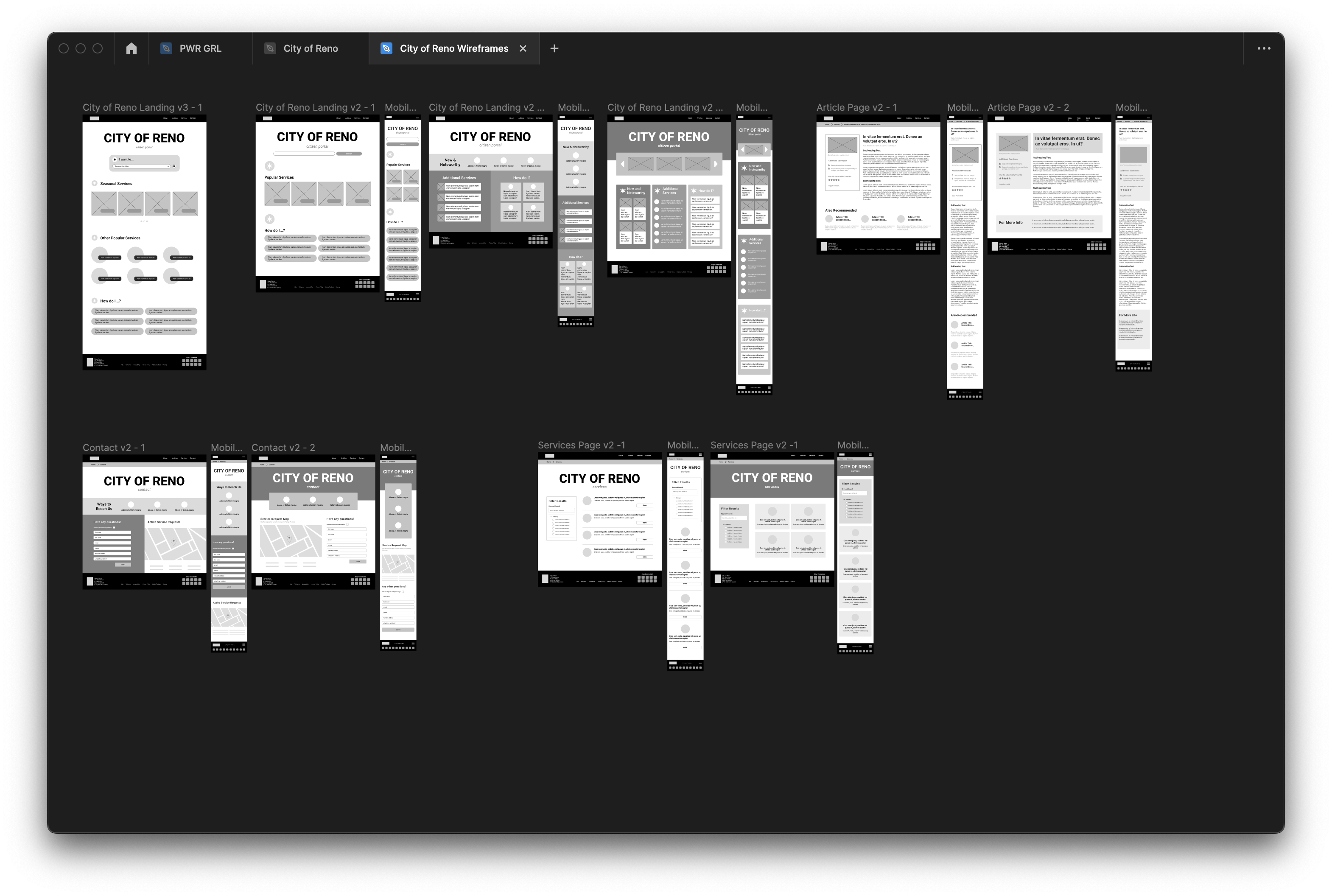
I then turn these into digital wireframes, which are given one additional review by our dev team before undergoing client review.
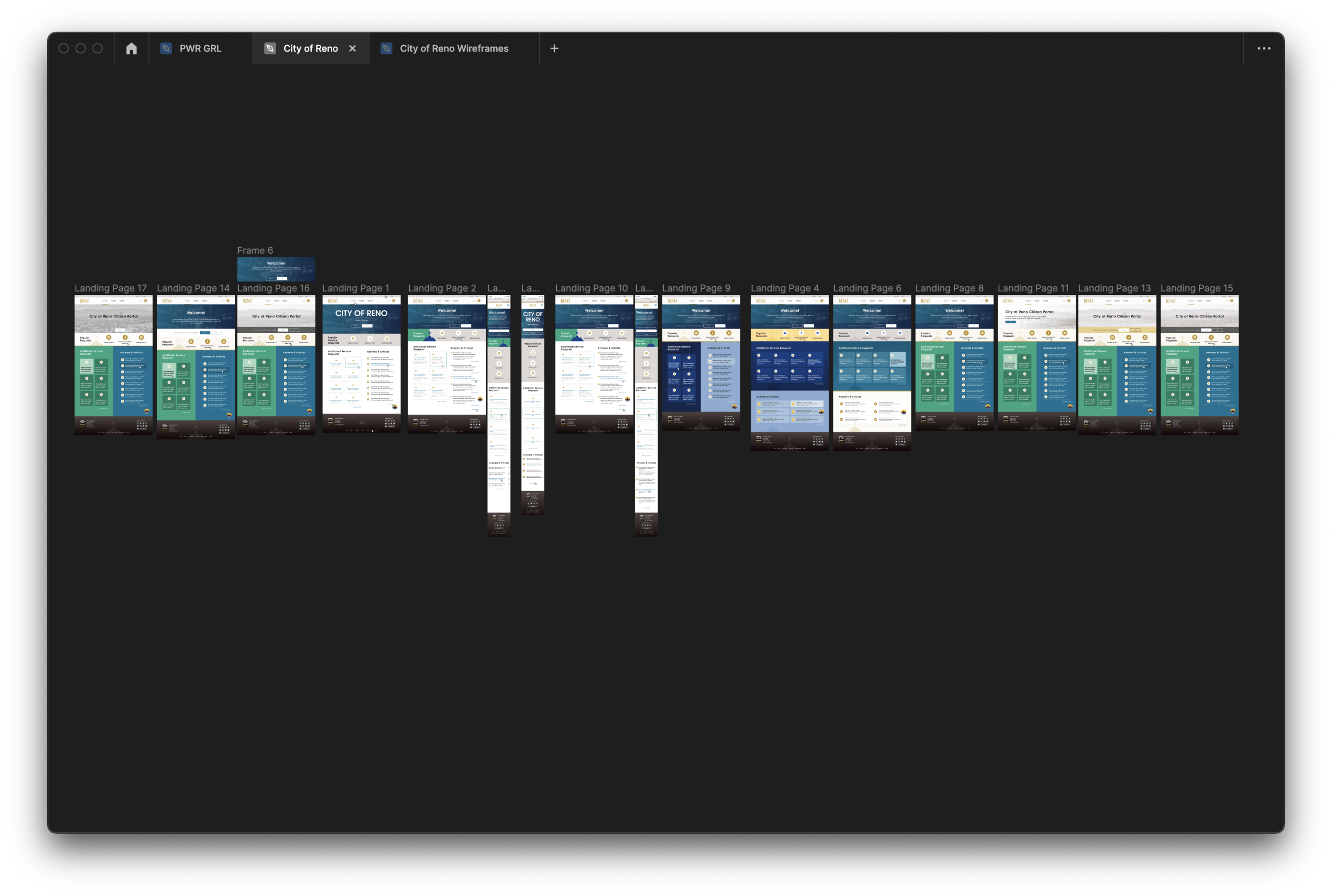
Unused landing page variations
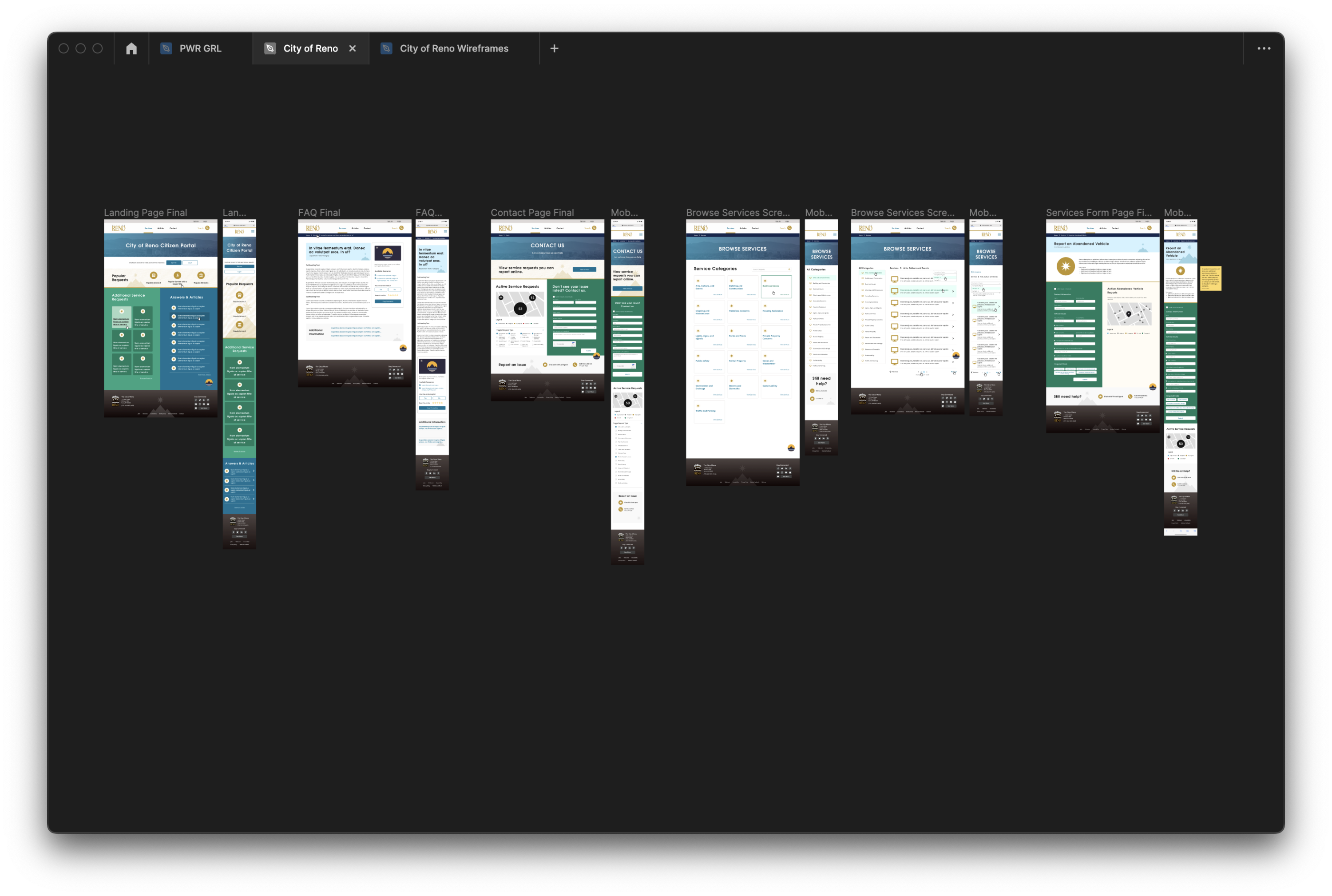
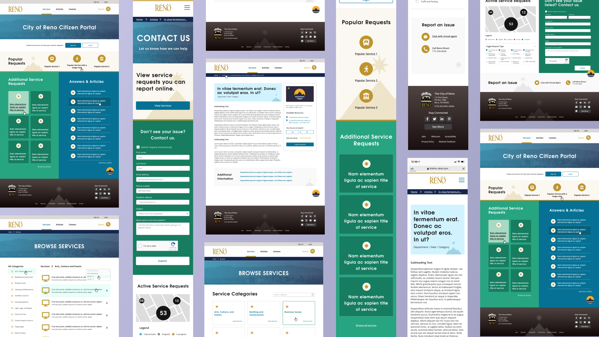
Final mockups for city of Reno’s 311 services portal
Mockups & iteration
Once we’ve gotten approval on wireframes, we begin developing the style guide (type, colors, icons, buttons/links, etc) and the mockups. These also undergo a final review by our project team before final review by clients. Once final approvals are given, I continue to think about additional views (what does something look like with one, none, or many?) and continue to work with the development team for styling for alerts, popup modals, and other mockups as needed.
