Typefaces are one of the most obvious ways to identify your brand to your users. The typeface you choose will speak volumes about the image you want to portray to your users and what values you prioritize. But there’s a million typefaces in the world. How do you ensure your content is legible to a variety of different users? Never fear, picking a typeface doesn’t have to be scary or difficult.
Helpful typography terms to know that will affect the legibility of the typeface:

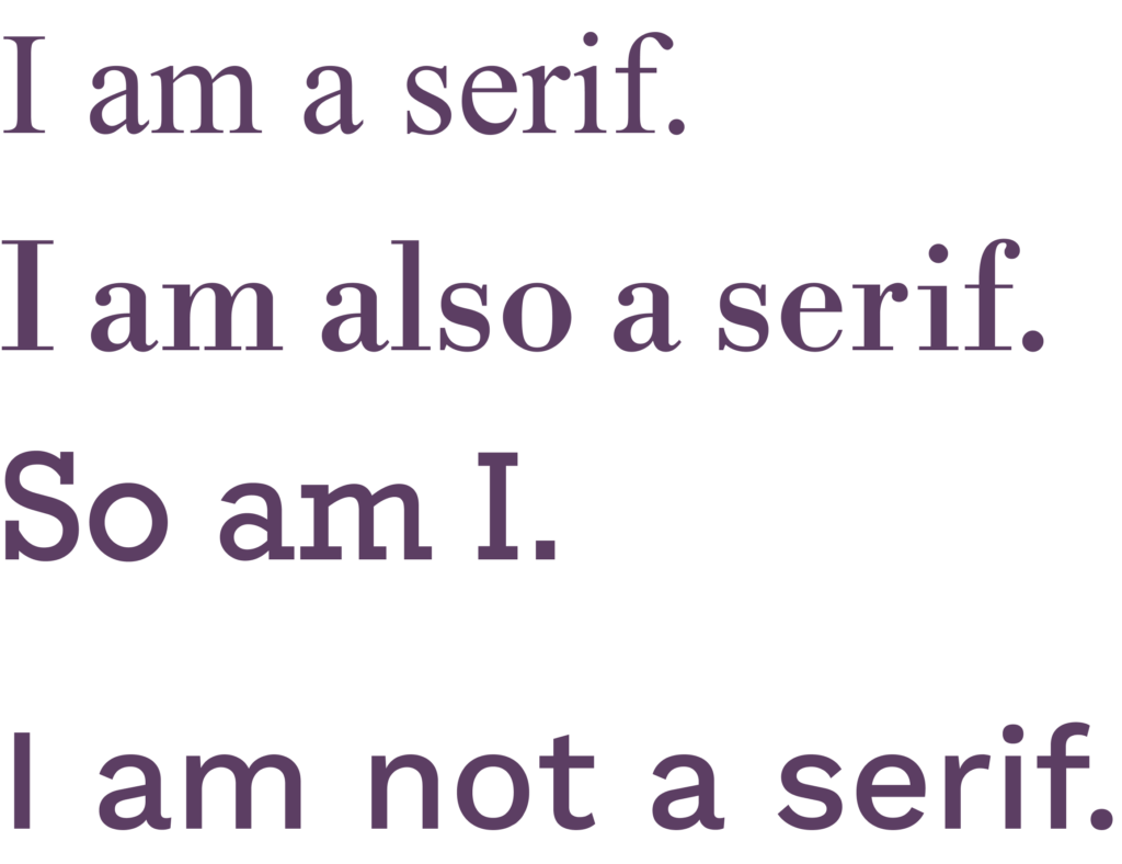
- Serif: Typefaces with decorative strokes at the ends of the letters (called serifs). Think Times New Roman, Baskerville, and Georgia.
- Sans serif: Typefaces without decorative strokes at the end of the letters. Think Arial, Futura, and Roboto Sans.
- X-height: Quite literally the height of the lowercase ‘x’ in a typeface. The higher the x-height, the larger the lowercase letters. This leads to better legibility when the type size gets smaller, especially on screens.
- Ascender/descender: Ascenders are any parts of a lowercase letter that go above the x-height (f, h, b, k) and descenders go below the x-height (g, p, q, y).
- Counter/bowl/aperture: These refer to the spaces that make up the inside of the letters. Counters are closed or partially-closed interiors of the letters (o, n, a, c, e); bowls are closed oval curves (b, q, p, g); apertures are the openings at the end of open counters (s, c, A, H).
- Ligature: Two or more characters joined as one letter (Æ, ff).
- Kerning: The space between individual letters.
- Line height (or leading): The space between the rows of paragraph copy.

1) Pick a typeface with good bones.

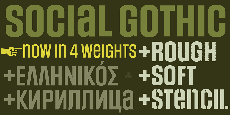
Choose easy-to-read typefaces and avoid script typefaces (ones that look like cursive handwriting), other fancy or weird typefaces, and typefaces that mix upper and lowercase characters or are ALL CAPS (like Social Gothic above). Additionally, avoid typefaces that use ligatures unless the word requires it. They will increase the cognitive load of your users and reduce legibility.
Choose typefaces with higher/larger x-heights and shorter ascenders/descenders (which will affect the line height and how easy it is to read paragraphs). Ensure the typeface has ample space between letters (kerning) as well as nice, open apertures (like in c, a, and e). This will ensure the typeface can scale at smaller sizes.

Serif vs San Serif Debate
Only designers would argue if little feet at the end of letters make something easier to read. Most legibility problems are solved by good heading and content structure, short paragraphs, and plenty of white space. However, if you do opt for a serif typeface, make sure it’s optimized for web.
2) Put a typeface through the “illicit” test.
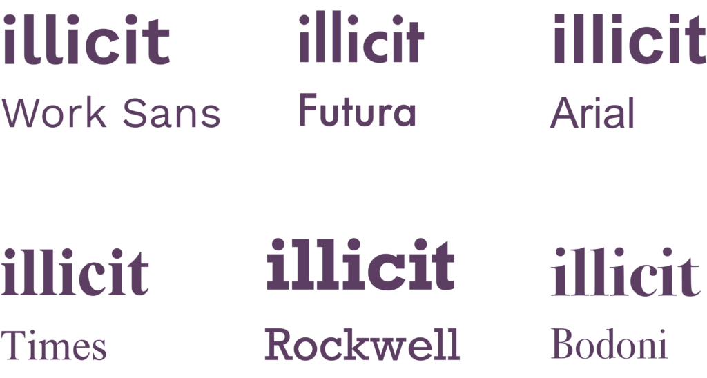
When using type testing tools on something like Google Fonts or Adobe Fonts, type in the word “illicit.” Do the i, l, and t disappear into one another and look more like a bar code than a word? That may be a good indicator to try another typeface. (Fun fact: Arial, a typeface lauded for being “accessible,” actually does not pass this test!)

3) Opt for good contrast.
Avoid thin or light weights. Even if they can pass a color contrast checker, they will be illegible to users with lower vision. Ensure that there is also good contrast between the different weights of each font.

4) Less is more.
I would recommend choosing no more than two typefaces (such as paring a serif and sans serif) and no more than three weights (regular, medium, bold or 100, 200, 300, etc). Avoid using italics as much as possible because it’s a challenge for dyslexic users (it changes the shapes of the letters). Keep paragraphs short and space out lots of copy with graphics, pictures, and/or illustrations.
In conclusion:
- Pick a well-designed typeface.
- Opt for good contrast between letters and weights.
- Limit the amount of typefaces and weights you use.
By spending some extra time up front evaluating a typeface, you are ensuring all users can engage with your content in a cohesive and inviting way.