Accessibility seems big and scary (the EU passed new legislation to go into effect in 2025 that could include jail time, and the US updated ADA regulations that go into effect starting in 2026).
However, it doesn’t have to intimidating or difficult to implement in your design or development! If you employ these six strategies at the beginning of your project, it will be much easier to address accessibility concerns and ensure your product is compliant.
1) Fix your color contrast

- Body copy, links, buttons, and any additional interactive elements (input field text, checkboxes, etc). should have a color contrast ratio of 4.5:1.
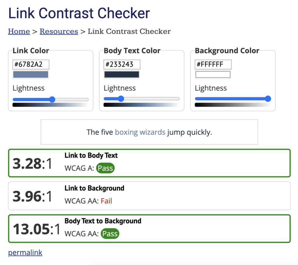
- Links compared to body text and supplementary graphics (tables, graphs, charts, etc) should have a color contrast ratio of 3:1.
- Minimize putting text on images unless there is some sort of overlay or background color (color contrast ratios still apply).
- Do not use reds/greens or purples/yellows beside each other (affects color blindness and other disorders). Be careful about using reds or yellows as background colors.

2) Improve your typography
- Use no less than 14px for paragraph copy. 16–18px is standard for body copy.
- Only center align short headings and maybe 1–2 short sentences. Left-align otherwise. Do not justify text.
- There’s a huge debate if sans serif typefaces (like Arial, Helvetica, Lato, etc.) or serifs (Times New Roman, Baskerville, etc.) are better for web. If you use a serif typeface, ensure it’s web-optimized. Avoid scripts (cursive), handwritten typefaces, or typefaces that mix upper-and-lowercase letters in an unusual way (like Social Gothic below). Please never use Bleeding Cowboys. Iykyk.
- Choose only 2–3 weights (regular, medium, bold) and avoid italics (those with dyslexia struggle with reading italics).

This is an actual screenshot from the website for the documentary Pushout. It uses a typeface called Social Gothic which we can see breaks ALL kinds of rules. Not only is it in ALL CAPS (bad), it breaks the standard practices of uppercase and lowercase letters (also bad). Also, this red doesn’t meet color contrast standards…and am I the only one who feels the red almost VIBRATES against the white? Brain angry. Anyway…typography has a lot of rules and considerations as well, which I will write about in more depth later.
3) Implement semantic HTML before ARIA
- Utilize native HTML (<button>, <h1>, <a href>) wherever possible. ARIA is good and useful, but it can actually be harmful if not used correctly. It’s best practice to use HTML then use ARIA.
- DO NOT DISABLE KEYBOARD FOCUS. If you’ve set up your HTML/ARIA correctly, you should be able to use tab on your keyboard to move through the different landmarks on the page (links, buttons, input fields, etc.).
- Does the tab order of the content make sense? Does it move through content in a logical way?
4) Rethink your content
- Speaking of headers, are you using good header structure and visual hierarchy? The structure of your content should be clear and logical.
- Are you using plenty of bullets, lists, and paragraph breaks to make your content easy to read and skim through?
- Are you using more plain language and less jargon? Are all acronyms spelled out at first reference?
5) Add alt text to your images
- Make sure all your non-decorative images have an alt attribute. It should convey the content and function of the image without being reading like you’re just trying to keyword stuff. Screen readers pick up basic grammar (periods, etc) so regular grammar rules apply.
- If the image is decorative, use an empty “alt” attribute (alt=””) on the image.

6) Include captions & transcripts
- For audio (like podcasts) or video, include a transcript or captions. Many video platforms already automatically capture transcriptions or captions.
(This is a great example of accommodations that benefit EVERYONE. Deaf or hard of hearing? Trapped somewhere loud? Learn better when you have pictures AND words? Watching the sub of an anime so the internet doesn’t ruin you with spoilers? There you go.)
Some of my favorite tools to use:
- Siteimprove Accessibility Checker
- WAVE Evaluation Tool
- WebAIM Color Contrast Checker
- WebAIM Link Contrast Checker
- Image Alt Checker
Final Thoughts
Accessibility isn’t just a legal obligation—it’s also a moral imperative that creates a better and more inclusive experience for ALL users. Start small with simple adjustments like improving color contrast and using accessible typefaces, then incorporate more complex semantic HTML and improve your content. Remember: it’s an ongoing journey, not a sprint to the finish. Rules and directives will change and technology will evolve. Using these six strategies, let’s continue to work toward developing more accessible and welcoming digital products!