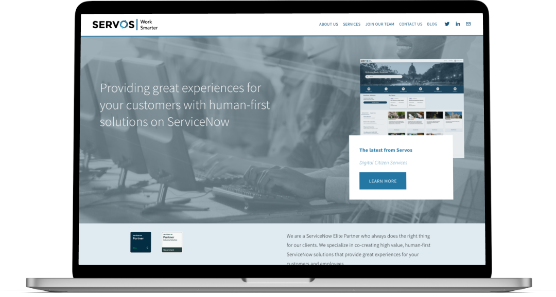
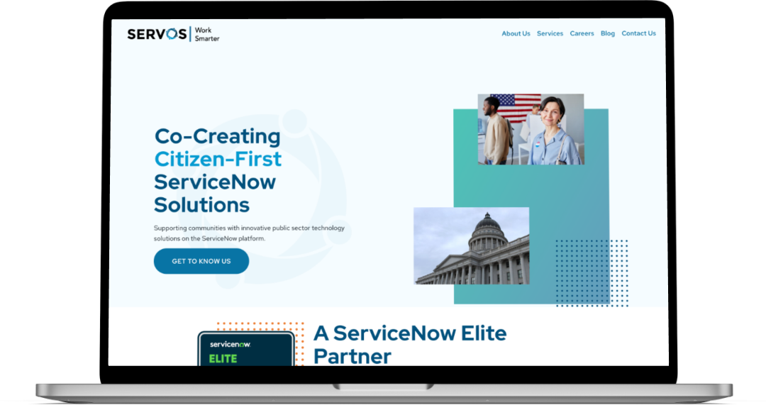
Redesigning the Servos Website in 3 Weeks
You can view the project here.
Overview
- Who Servos, LLC
- What Refreshed branding and updated website design
- Role Competitive analyses, style tiles, mockups
Results
Since the relaunch in Jan 2023:
- 143% increase in impressions
- 52% increase in clicks
- 3% decrease in bounce rate
- 43% increase in site visits
Challenges
Rolling with the punches
Our leadership team gave us three weeks to design and implement the final designs, in addition to our typical duties, in order to have the new site unveiled for one of our biggest client conferences. During this time, our design lead Sarah was also transitioning to a new role, so she had to baton pass some final development off to Dan (our other UX designer) and I.
Learning on the fly
Our website uses Squarespace, so I had to learn a new platform. At the time, Squarespace had recently updated its platform to the fluid builder, so we had to learn its new workflow as well as its limitations.
Design isn’t linear
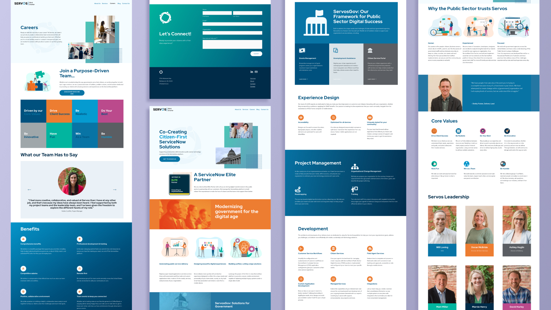
Ideally, design follows a well established flow. However, by better understanding our stakeholders, we knew doing design the “normal” way wouldn’t be the best experience. That’s why we decided to forgo traditional wireframes and opted to do style tiles and high-fidelity mockups so our leadership team would have a very concrete idea of our vision in a way that met our timeline.
Process
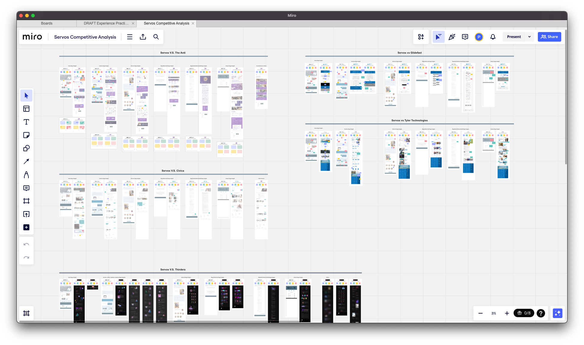
Competitive analyses
Our team analyzed the website’s of some our direct competitors, as well as some of our non-direct competitors. We analyzed their visual style, website architecture, social media, case studies, and other content to understand their strengths and weaknesses.
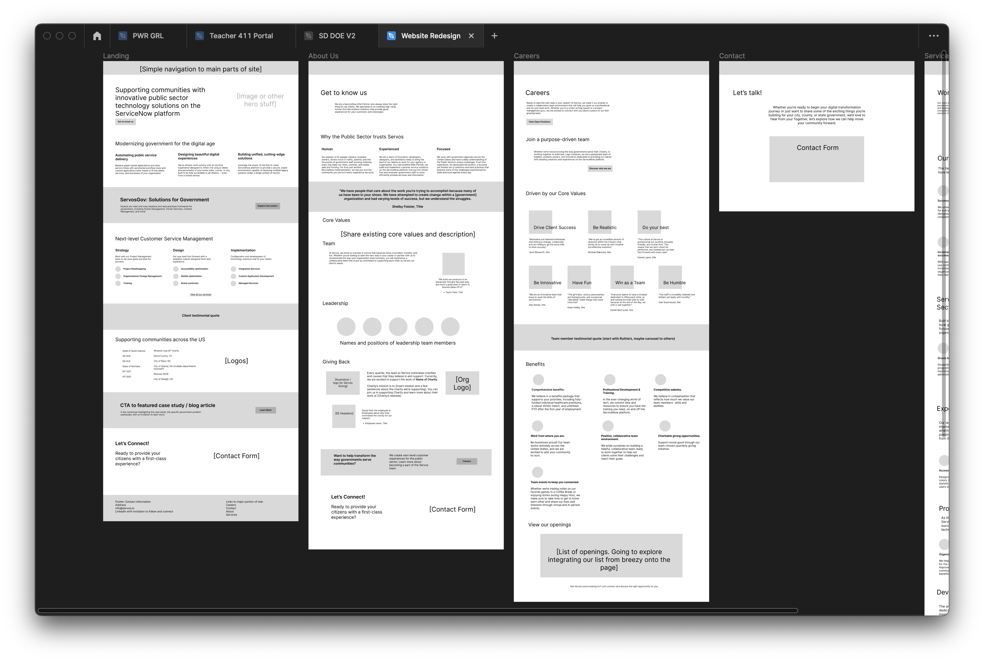
Zoomed-in view of Servos refreshed web design wireframes
Wireframes
Since we were on such a tight schedule, our manager Sarah designed the wireframes in a more content-heavy way while Dan and I divided and conquered on the analysis and research. This allowed us to get immediate buy-in on the CONTENT first.
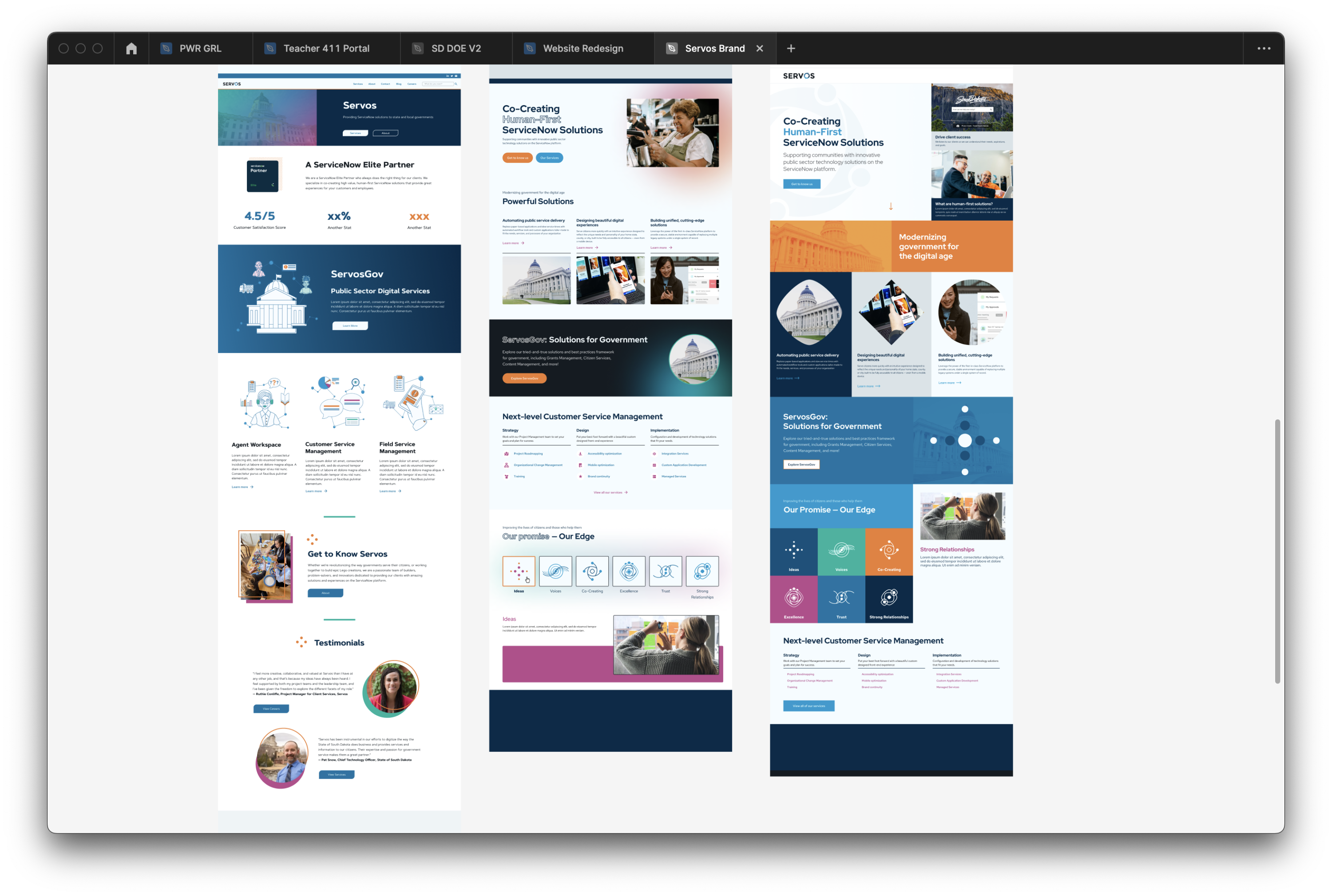
Zoomed-in view of Servos refreshed web design style tiles
Style Tiles
Because our team is still small, our leadership team is busy spinning a LOT of plates. Dan and I opted to design several style tiles to give the leadership team a chance to preview content in more complete sections, and they chose what content they felt most accurately reflected Servos’s look, feel, and mission.
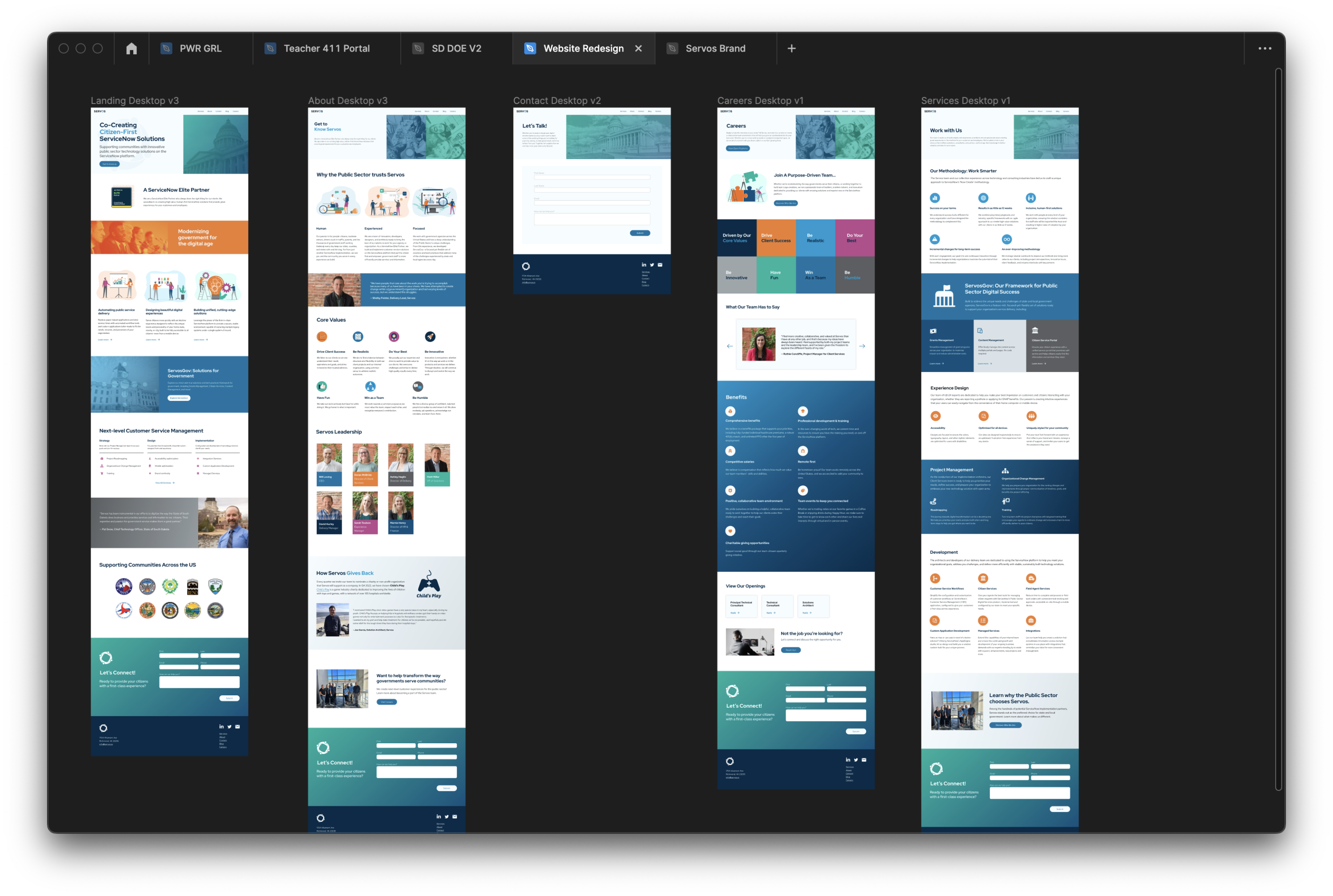
Mockups & implementation
Based on leadership feedback, I designed the final mockups in less than two weeks, while Sarah took on the brunt of the implementation before she left. Before she left, we had a knowledge transfer, and Dan and I finished the final phases of the implementation.
